For over a century, J.P. Weigand & Sons, Inc. might be the most viewed logo in Kansas. J.P. Weigand & Sons, Inc. has been instrumental in the growth and development of residential, commercial and industrial real estate in the city of Wichita, the Wichita, KS. area, the Kansas City area and parts all over the State.
We decided immediately that the process for changing such a historically influential and important brand logo and brand identity should be a deliberate one. J.P. Weigand & Sons, Inc., with over a hundred years of equity in the name and several decades of equity in their brand logo would be best served to avoid any drastic change. But, their logo, designed in the 70's, was poorly thought out and caused readability and usage problems that at minimum needed to be fixed.
Before, the J.P. Weigand & Sons, Inc. logo used a clunky type for the word 'Weigand' which had little negative space around and inside the letterforms. For example the "A" became a solid blob, and the letters bled together which made it difficult to read at a distance. We opened up the letterforms in the word 'Weigand' making it much easier to read at a distance. Also, the basic oval shape was divided by a white strip that made it impossible to use against a background color. Weigand was stuck using a white background with the their logo which made their signs disappear in the marketplace. To correct this we enclosed the oval shape so the brand logo could be used with background colors. This was a simple, but important fix because it allowed for designs that use color more dramatically to differentiate Weigand’s marketing material and realtor signs from a marketplace filled with predominately white signs.
We also made adjustments to color and added a piece of history. We changed the bright blue to a deeper more substantial, blue befitting the regions real estate leader for over 100 years. We added the historical signature of founder J.P. Weigand, created by hand form vintage letter forms, to elevate the illustrious history of the J.P. Weigand & Sons brand.
All in all, the Weigand brand is now positioned more appropriately in the marketplace. It has a sense of history and emphasizes a reputation of excellence, and quality, which is a perfect fit with their brand promise.
The logo design, tagline and brand identity are used on corporate signage, website design, facebook, realtor signs, direct mail, brochures and collateral material, advertising, on-line marketing and more.
Tracy Holdeman is Executive Creative Director of Whisper and Insight Design Communications. You can see Tracy’s logo design, graphic design, brand design and website design work at InsightDesign.com.
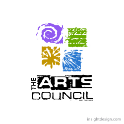
The Arts Council logo depicts four modes of artistic expression all hand drawn
Location:
Logo design Wichita, KS
Style:
Illustrative logo design
Industry:
Arts logo design

The Green Ranch logo design is a cowboy hat twisted to reveal a green leaf to signify it's organic mission.
Location:
Logo design Denver Colorado
Style:
Conceptual logo design
Industry:
Beef logo design
Victory in the Valley is a non-profit organizati
Location:
Logo design Wichita
Style:
Initial logo design
Industry:
Healthcare logo design
Naples Remodeling
Location:
Logo design Naples Florida
Style:
Crest logo design
Industry:
Construction logo design

Swiss Arabian’s Darbuka brand perfume borrows its name from an Arabic drum. The drum’s expressive and vibrant rhythms along with Henna are the inspiratio
Location:
Dubai logo design
Style:
Illustrative logo design
Industry:
Beauty logo design

U-Organize
Location:
Dallas logo design
Style:
Hand drawn logo design
Industry: