 Wichita logo design for Tanya's Soup Kitchen is an image of Tanya herself and a bowl of soup combined in one. The Wichita logo design is a visual manifestation or metaphor to show Tanya is the equal of a true artist. Tanya puts herself into her creations, her art, her soup. Website
Location:
Wichita logo design
Style:
Creative logo design
Industry:
Food and beverage logo design

Anniversary logo design. Carlos O'Kelly's is a Mexican Cafe restaurant chain. The 30th Anniversary logo design references a vintage Southwest promotional logo.
Location:
Wichita logo design
Style:
Retro logo design
Industry:
Restaurant logo design
Not all logo designs are made with images, some are made with texts and images while others are simply text. A logo design that is only text is called a typography logo, logotype, wordmark or signature mark. The type can be very straight forward or illustrated to communicate a specific feeling or attitude.
Squeezer's Palace is a re-creation of a 70's ice cream store. We developed typography for the logo based on historical 70's fonts. We hand illustrated the logo letterforms to match the essence of the original hand drawn logo. Redesigning the letterforms also allowed us to make the logo more compact and there fore more legible as store signage.
Location:
Logo design Wichita
Style:
wordmark logo design
Industry:
Restaurant logo design

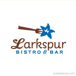
Larkspur Bistro & Bar is a restuarant in historic Old Town in Wichita, KS. The logo combines a fresh bohemian look with retro typography. Website.
Location:
Wichita logo design
Style:
Conceptual logo design
Industry:
Restaurant logo design
What makes Larkspur different?
The rebranding of one of Wichita's historic restaurants meant changing an old "cowboy" bar and grill graphic design look to a fresh, unique and surprisingly new logo, website and brand identity. The logo is now a retro-modern stylized larkspur flower stuck by a fork. The "Bohemian" style illustration gives a simple logo image character and depth. The brand logo is anchored with historical, yet contemporary typography to fit Larkspur's bistro and bar cuisine, atmosphere and attitude. The full breadth of the brands typography is modern and historical with revamped old foundry fonts used in combinations reminiscent of the Old Town era and area that the Larkspur restaurant stands within. The logo design and brand colors are both retro and modern with a traditional brown combined with a new age cyan blue. It's bright and fresh.
The brand website is designed to instantly communicate Larkspur's brand promise with a large visual menu that illuminates Larkspur's four engagement benefits; atmosphere, great wines, delicious cuisine and a better banquet and catering experience. The website design is built around those four differentiators. They are built into the functionality and content of the Larkspur brand website architecture. A secondary menu makes available all the usual information consumers expect. The Larkspur website design uses iconography, photography, space, shape, size, color, words, interaction and movement to take the consumer through an ideal brand experience.
In creating this distinctively different logo, brand and website design look, feel and architecture fundamental differentiators were exploited. Larkspur's values and consumer touch point to experiences were defined into the brand design.Four different fonts and unique simple colors were orchestrated, combined and modified to make this new Wichita logo design distinctively different.
Insight Design Communications is a logo and brand design graphic design firm with an exceptional record of success. Client: Vornado. Work: Logo Design, Brand Promise, Brand Strategy and Architecture, Brand Guide or Corporate Identity Manual, Branded website and Facebook page, and other graphic design elements like; Menus, Uniforms, Stationery, Signage, Business Cards, Gift Cards and Advertising.

