This is Logo Design Wichita the website of Tracy Holdeman, a graphic designer that specializes in exceptional logo design, corporate identity and branding across all graphic platforms – web design, social media design, print design, advertising design, marketing, online marketing and environmental design. In a world of overwhelming consumer choice and 24/7 marketing messages bombarding all of us the average logo design and branding will not be effective. Different is good. Different and relevant is great. Different, relevant, and perfectly executed is the ideal. For more information or just a conversation call me at 316 262 0085 or e-mail tracy@insightdesign.com. Our work is reasonably priced with special pricing for start-ups, entrepreneurs and small businesses. I look forward to working with you.

ldw logo main

Thanks to our Guest Blogger, Jeff Faflick, Marketing Director at Carlos O'Kelly's.


Inspired rebrand.

Long time regional Mexican restaurant chain Carlos O'Kelly's rebrands.


Carlos O'Kelly's rebranding was designed to reach a new, younger audience, changing the way, people perceived the 30 year old restaurant chain. Once Carlos O'Kelly's determined that, rebranding was necessary, the next question was how much? Would Carlos O'Kelly's, need a radical rebrand, a subtle rebrand, or somewhere in the middle? One of the, influential individuals at the forefront of this rebranding effort was Jeff Faflick., Jeff is the Marketing Director at Carlos O'Kelly's and has been in the marketing and, advertising industry for 26 years. "Our existing brand was towards the end of it's lifecycle, our vision was to captivate a new younger audience while keeping the vast majority of our current customer base intact" said Faflick. Carlos, O'Kelly's moved first to define their brand in the realm of ideas. Carlos O'Kelly's brought in Tracy, Holdeman, Executive Creative Director of Insight Design Communications. Tracy guided, them through the brand promise process. Once their brand promise was in place, Insight developed a number of logo designs and creative solutions. Eventually, Carlos O'Kelly's, focused on the "twisted pepper." Upon completion of the logo, Insight created, all the brand identity materials, including new menus for lunch, dinner and carryout, as well as, carryout bags and various store graphics. Throughout the the rebranding process, Carlos, O'Kelly's worked to develop a new set of menu items which focused on more hand, held foods and unique flavor combinations to inspire a new clientele. "Some of the dishes were not finalized until the last hour. That process of renewal will be a consistent practice at Carlos O'Kelly's". said Mr. Faflick


The brand promise boiled down to "Inspired Mex", which in the Carlos O'Kelly's vernacular means is an entire set of ideas.


Inspired Mex

Carlos is redefining the Mexican dining experience. We believe that those things that inspire us will inspire you, too. Think inspired food served in inspired ways by inspired people. We’ll do the searching, the finding, the refining and you can sit back and enjoy the rewards of our efforts.

Limitless

Inspired Mex is not a destination; it’s a journey. If you come along with us, we promise there will always be something new and exciting around the next bend in the road -- endless opportunities to delight. after you order it, and just the way you want it.

Fresh

We make our salsa fresh everyday. Our food is made from scratch and we oven-bake it to get the fully developed flavors of a home-cooked meal. Everything we bring to your table is made one plate at a time, just after you order it, and just the way you want it.

Quality

Quality is the result of doing a thousand little things right. The best ingredients brought together in the best possible way by people who care about what they’re doing. It is the caring that makes all the difference.

Unique

Inspired Mex is Mexican with a twist. Having a name like Carlos O’Kelly’s gives us the freedom to bring the flavors and fun of Old Mexico together in new and interesting ways. Generously sprinkled across our menu are signature items that are uniquely Carlos.

Family Owned

Our family has owned and operated Carlos O’Kelly’s all the way back to that first inspired moment in 1981. Why does it matter? Who loves something more than the creators? Who is going to care more about the restaurants’ reputation than the people who have spent 30 years cultivating it? It matters to us.


MenuCoverLogo

Carlos O'Kelly's logo design.


DinnerMenuInside

Carlos O'Kelly's menu design.


http://www.insightdesign.com/index.htm

Published in Guest Blog
Carlos O’Kelly’s Mexican Café event logo.

Carlos O’Kelly’s Mexican Café event logo for an in-store Mexican Fiesta promotion. The type is created to appear as a mosaic. Logo design Des Moines, Omaha, Wichita, Topeka and more.

Location:

Wichita logo design

Style:

Conceptual logo design

Industry:

Restaurant logo design
Published in Logo Design
Carlos O'Kelly's Golf Championship icon design

Carlos O’Kelly’s Mexican Café chain golf tournament icon. It’s a fun time for everyone. So we made a serious golfer swinging a fork.

Location:

Logo design Wichita

Style:

Figural logo design

Industry:

Golf logo design
Published in Logo Design
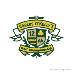
Carlos O'Kelly's Golf Championship logo design

Carlos O’Kelly’s Mexican Café golf tournament is just a fun time for vendors and employees. So we made a serious “Golf Championship’ logo to be funny.

Location:

Logo design Wichita Kansas

Style:

Crest logo design

Industry:

Sports logo design
Published in Logo Design

Capabilities

Services and Capabilities

Logo Design & Brand Identity

  • Logo Design
  • Brand Promise
  • Brand Positioning
  • Corporate Identity
  • Complete Brand Identity
  • Brand Guide
  • Identity Manual
  • Graphic Design
  • Naming
  • Tagline Development
  • Brand Architecture

Graphic Design

  • Business Cards
  • Stationery
  • Letterhead & Envelopes
  • Presentation Folders
  • Brochures
  • Package Design
  • Brand Packaging
  • Illustration
  • Scales Sheets
  • Icon Design
  • Product Design
  • Campaign Materials & Signage
  • Direct Mail & Postcards

Environmental Design

  • Signage
  • Billboard
  • Posters & Banners
  • Vehicle Wrap Design
  • Window Graphics
  • Retail Point of Purchase (POP)
  • Storefront Design
  • In-store Product Placement & Layout
  • Endcap Design
  • Mural & Retail Wall Design
  • LED Lightboard Design
  • Stadium & Sports Sponsorship
  • Freestanding Signage

Web Development

  • Web Design
  • eCommerce Websites
  • Content Mangagement Systems (CMS)
  • Search Engine Optimization (SEO)
  • Editing, Management & Consultation
  • Blog Creation
  • Banner Ad Creation
  • Website Marketing
  • Website & Domain Administration
  • Social Media Marketing

Logo Feeds

  • Beyond Napa logo design Beyond Napa logo design

    Beyond Napa is a Wine and Wine Accessory Boutique in the Old Town district of Wichita, Kansas. The boutique sells wine by the bottle and wine accessories which is reflected in the logo design. A cork screw, that also looks like a grape vine, is twisting into a graphic representation of grapes. The brand logo communicates wine but also wine accessories all in one instant visual. The Beyond Napa logo design is an international award winning logo design that will appear in Graphis Logo 8. See Beyond Napa

    Location:

    Wichita logo design

    Style:

    Conceptual logo design

    Industry:

    Food and beverage logo design
  • generationOn logo design generationOn logo design

    generationOn is a new movement igniting the power and potential of all young people to create more good in their lives and the lives of others. Newly created within the Points of Light Institute, generationOn will be the largest youth volunteer action organization in the nation.The logo depicts a fingerprint on the world. The tagline says it all to parents, school administrators, teachers and kids ages 4 through 16, “Make your mark on the world”. See generationOn in use

    Location:

    New York logo design

    Style:

    Illustrative logo design

    Industry:

    Nonprofit logo design
  • River of Life Worship Center Logo River of Life Worship Center Logo

    The River of Life Worship Center church is a Pentecostal church and community center known for the raising of hands in the worship of GOD.

    The church logo is an extremely unique visual where one image can be seen as two different ideas. The logo at one look is hands raised to the Heavens reaching for GOD. With another look the logo is the Christian symbol for the Holy Spirit, a dove. Specifically within the Pentecostal beliefs the dove is associated with baptism, of which water is used. Moreover, the two images tell the story of conversion. The hands reaching to GOD become filled with the Holy Spirit, the image of the dove. The conversion, being filled with the Holy Spirit is The River of Life. The River of Life logo is an international award winning logo design that will appear in Graphis Logo 8.

    Location:

    Logo design Wichita area

    Style:

    Conceptual logo design

    Industry:

    Church logo design
  • Lost Art Development Company logo Lost Art Development Company logo

    Lost Art Development Co.: Wholesaler of Home Decor, Garden Decor and Gift Products for Retail

    Lost Art Development Co. searches the U.S. and beyond for unique artist who’s art will translate into retail products.

    The Lost Art Development Co. is an international award winning logo design that will appear in Graphic Logo 8.

    Location:

    Logo design Wichita Kansas

    Style:

    Illustrative logo design

    Industry:

    Arts logo design
  • Catalyst Marketing logo design Catalyst Marketing logo design

    Business Sales for the Industrial MarketCatalyst Marketing jump starts or re-starts industrial businesses with aggressive sales assistance.

     The gear is jump starting, igniting with a jolt of torque. The flame/saw blade gives the image an aggressive edge to mirror the companies approach.

     The gear and saw blade both communicate that Catalyst Marketing’s focus is on the industrial market.

     The letter “C” (for Catalyst) is in the gear.

    Location:

    Wichita logo design

    Style:

    Conceptual logo design

    Industry:

    Marketing logo design
  • Golf logo design Golf logo design

    Carlos O’Kelly’s Mexican Café Chain: Golf Tournament LogoCarlos O’Kelly’s Mexican Cafe is a 7 state regional restaurant chain. It is both, a Mexican cafe and an Irish bar.The Carlos O’Kelly’s golf tournament is no championship. It’s just a fun time for vendors and employees. So we made a serious “Golf Championship’ logo to be funny. This golf logo design is an international award winning logo design that will appear in "Logo and Letterhead 12.

    Location:

    Logo design Wichita, KS

    Style:

    Crest logo design

    Industry:

    Sports logo design
. . . . . . . . . . . . . . . . . . . . . . . . . . . . .
WAIT